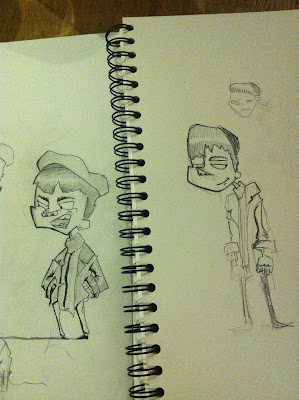
Now that the design of the project is going to be using textures, I started to look at texturing the characters. This was before I did the room concept so now I've done that I am going to re-texture them again as I need to put the background and character together.
Thursday, 6 December 2012
Character design progress - Line Up version 1 (EDIT)
After taking the line art and colour that Kylie did for us I went back to it and tweaked Max (left) so he was more on model. I think That Patsy's hat still needs a bit more development and i've done a couple reworks.
Tuesday, 4 December 2012
Thursday, 22 November 2012
Character Colouring
Kylie has joined our crew and she's been colouring in Elliots character designs.
Both characters next to each other (Left Patsy, Right Max)
Patsy
Max
Background Design and Concepts
Final background designs of street buildings
Phoebe Herring has also been doing some concept art for us (below)
Next Phoebe created a rough model of the street, working closely from my background outlines.
"I aimed to keep the blocky exaggerated feel and to match the lighting in the visual references for the project, which is set in 1940s New York. I'm pleased with this model, and I think that it will help me to avoid mistakes that I made in the painting. Also, experimentation with lighting was much easier when I worked from it." - Phoebe
Below is the model with added texture.
Wednesday, 21 November 2012
Train Carriage Design
I've been working on the design of the train carriages, starting with rough sketches of possible design.
 |
| Initial sketches of train cart designs from reference and just seeing what went well where. |
 |
| Adding a bit more detail. As Marc suggested I'm going to add some coal to the bottom left cart. |
Next I'm going to use just the shapes and but them in a line up to see which go better visually in terms of shape. (- Kirstianne)
Monday, 19 November 2012
Car Design
I've been working on some of the rough car designs today so for reference I've been looking at a load of 1940s cars and some from films that captured my eye. When thinking about the style I just did some rough sketches of the original design then started to play around with warping the shape to fit our style. (- Kirstianne)
Lighting Research
I really like the use of light/dark in the nightime scenes in 'A Monster in Paris' and think these particular shots are good examples of that, particularly the alley scenes. (- Kirstianne)

Character Design Process
Here is the first color concepts of Max (right) and Patsy (left)
These had style problems and didn't communicate the character well. Colours were not right. Below is first rework shows a more streamlined look but was still far too clean and still didn't fit into the backgrounds.
MAX

PATSY
These are the most recent versions of Patsy which are a lot more edgy. I think that they have progressed so much and i'm pleased with the way they are turning out.
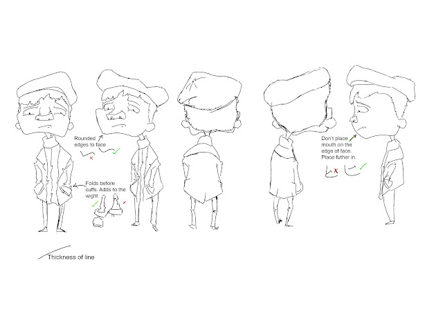
Turn around
Subscribe to:
Comments (Atom)


 Link
Link


